Diamond Data
Goal
My goal is to determine the relationship between a diamond’s carat and price.
Data
The data is a sample dataset included in the tidyverse r package. It has variables such as carat, price, cut, color, and depth.
q <- ggplot(diamonds.small,aes(x=carat, y=price))+
  labs(x="Carat",y="Price")

q + geom_point() +
  theme_minimal()#scatter plot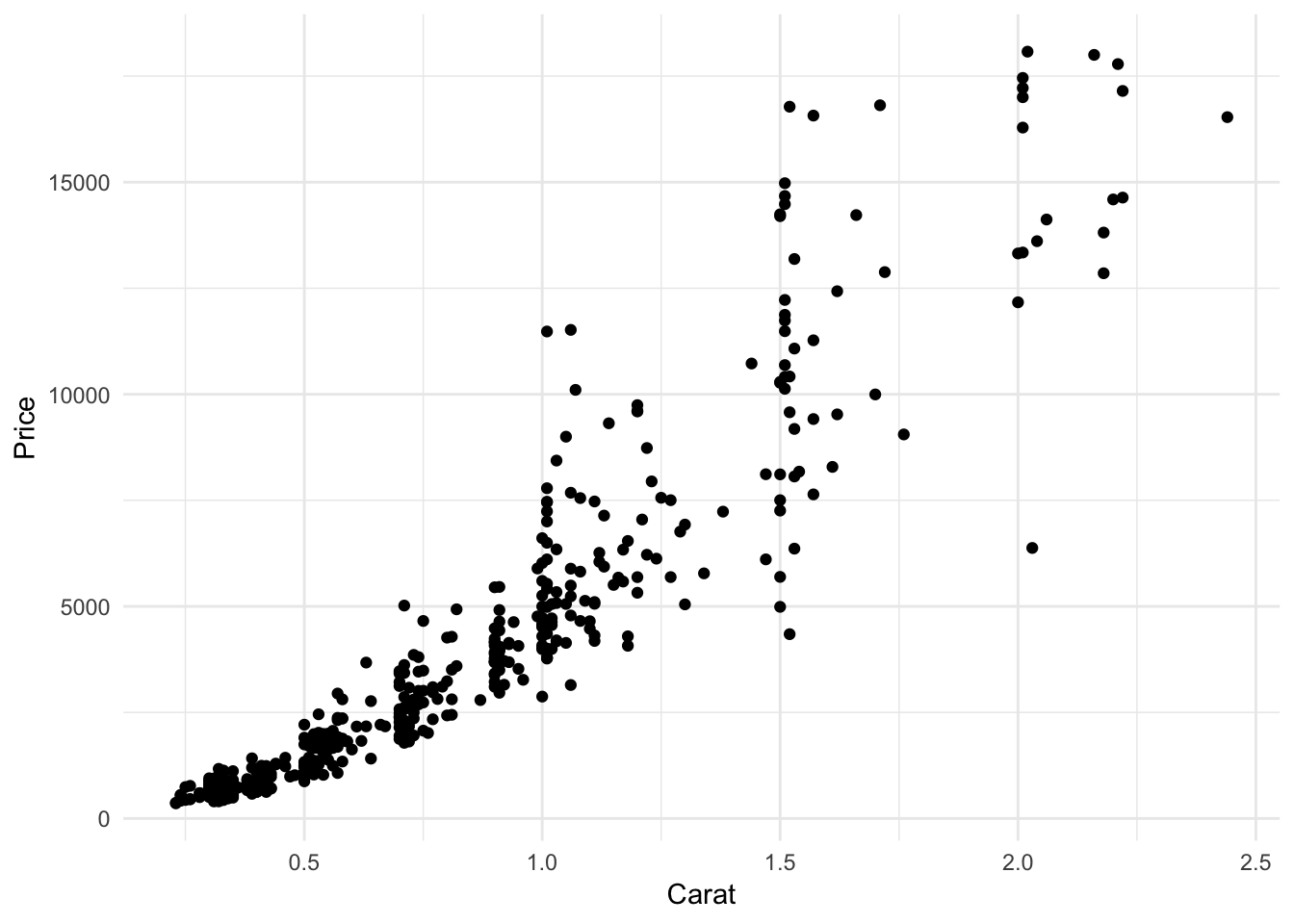
Graph 1: A standard scatterplot of carat vs. price
q + geom_count(aes(size=..prop..),alpha=.5) #bubble plot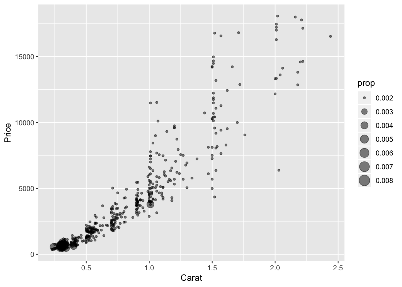
Graph 2: A scatter plot of carat vs. price in which the size of the points is proportional to the frequency (sometimes called a bubble plot)
q + geom_count(aes(size=..prop.., color=as.factor(cut)),alpha=.5) #bubble plot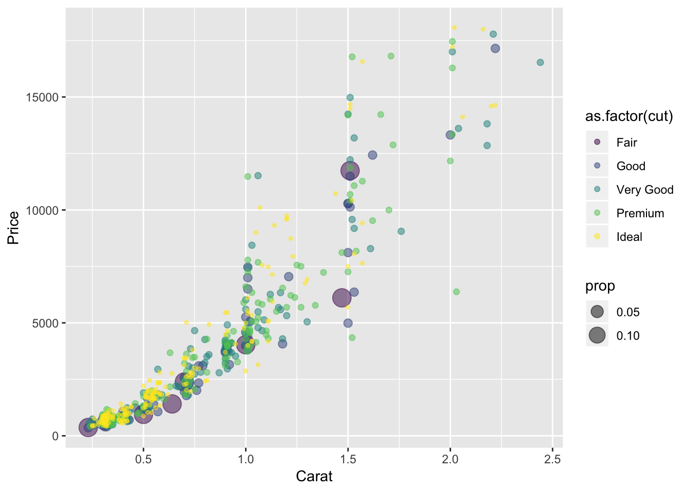
# q + geom_count(aes(color=as.factor(cut)),alpha=.5) #bubble plotGraph 3: A scatter plot of carat vs. price in which the size of the points is proportional to the relative frequency and the color is determined by the quality of the cut
q + geom_bin2d() # tile plot displaying 2D density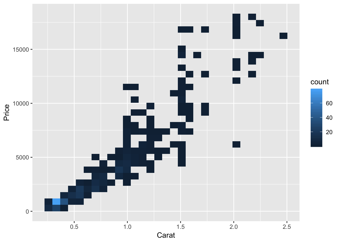
q + geom_bin2d(bins=c(20,20))#+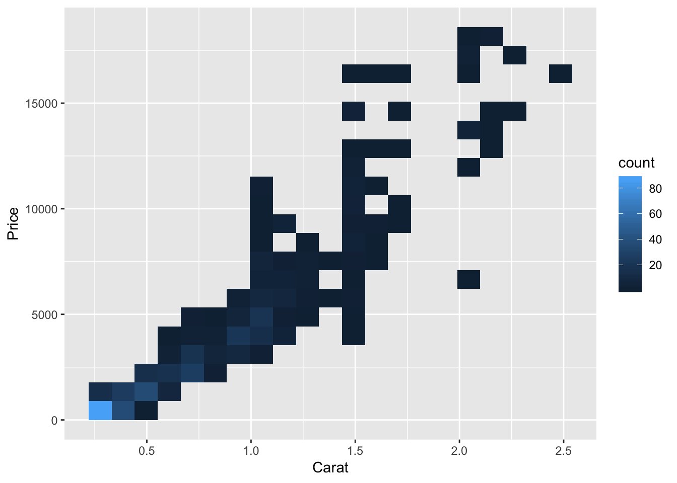
# geom_jitter(color="green")#controlling binning in tile plotGraph 4: A tile plot showing the observed bivariate density of carat and price
q + stat_density2d(aes(color=..level..))+scale_color_gradientn(colors=topo.colors(5))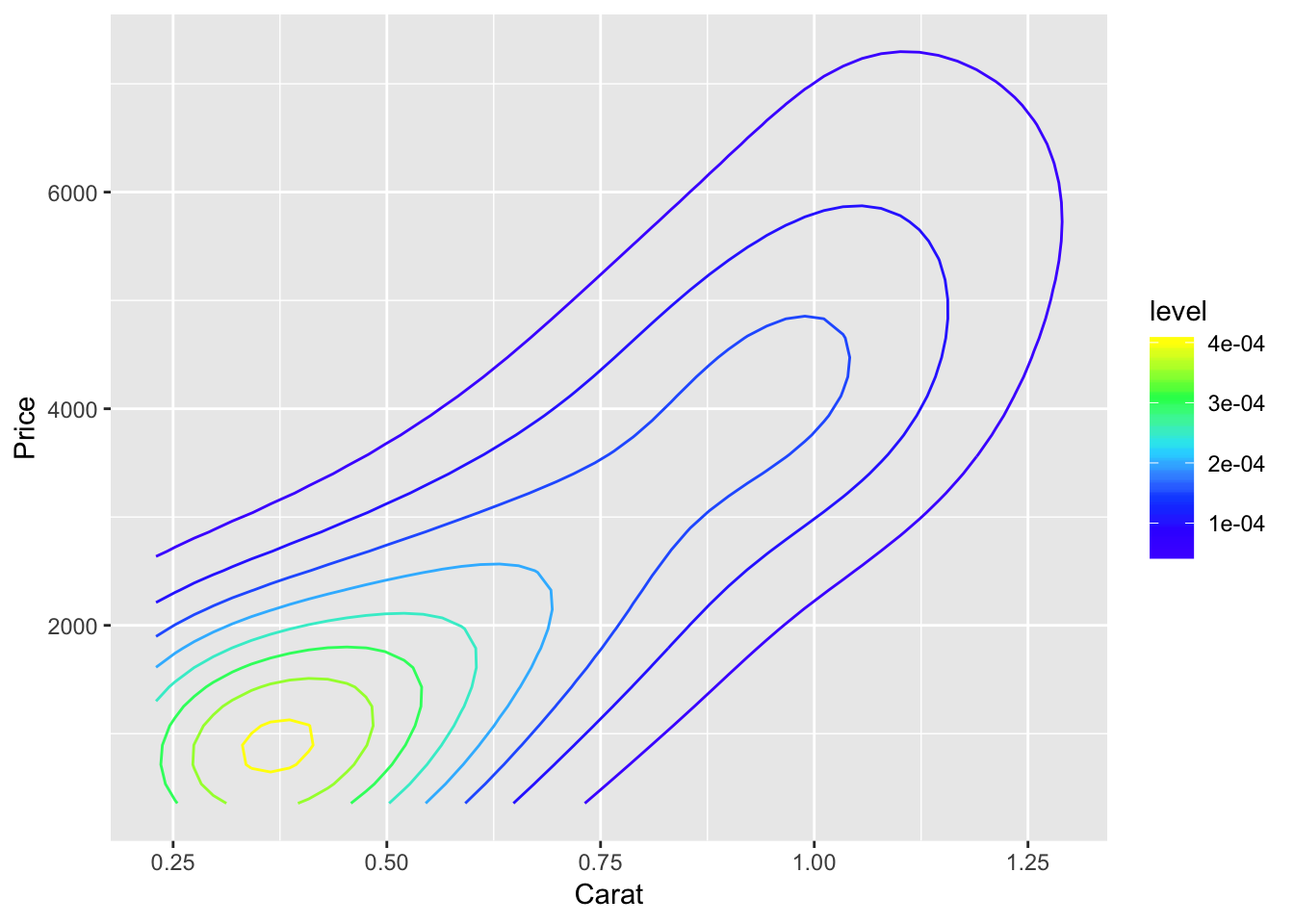
Graph 5: A contour/level plot showing a two-dimensional kernel density estimate for the bivariate distribution of carat and price
q + geom_jitter(alpha=.5)+
  geom_smooth(method="lm",se=T,level=.95)#jittered scatter plot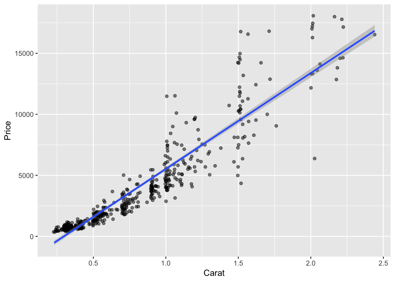
Graph 6: A jittered scatter plot of carat versus price overlaid with the least squares regression line for predicting price based on carat. Include the 95% confidence bands around the line.
graph7 <- ggplot(diamonds.small,aes(x=carat, y=price,color=as.factor(cut))) +
  geom_jitter() + geom_smooth(method="lm",se=T,level=.67)
graph7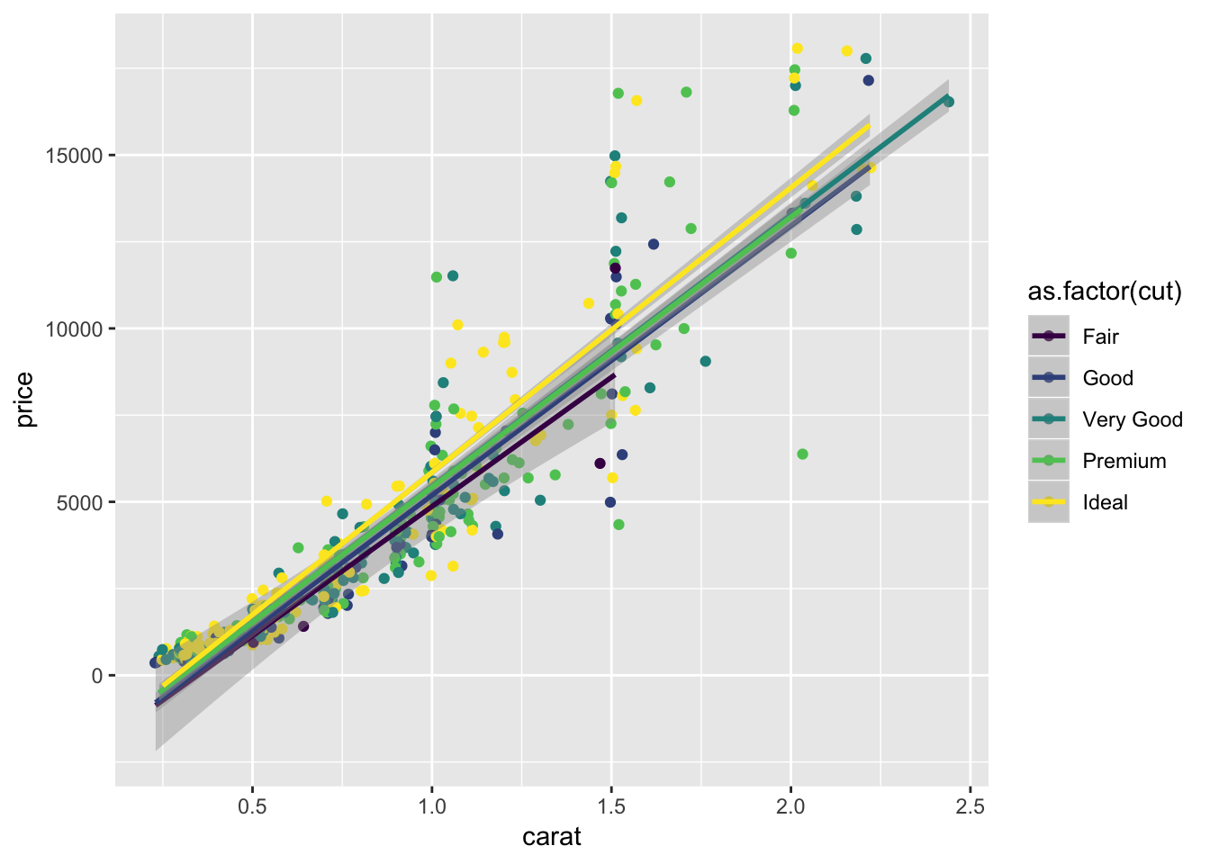
Graph 7: A jittered scatter plot of carat versus price in which the cut quality is mapped to some aesthetic, overlaid with separate least squares regression lines for predicting price based on carat for each cut quality. Include the 67% confidence bands around the lines.
graph8 <- ggplot(diamonds.small,aes(x=carat, y=price,color=as.factor(cut))) +
  geom_jitter() + geom_smooth(method="lm",formula=y~poly(x,2),level=.50)
graph8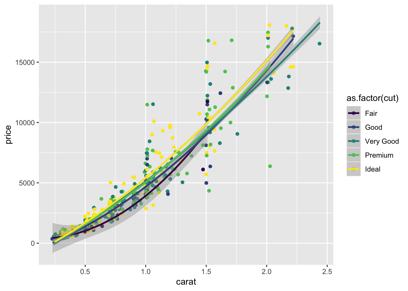
Graph 8: Repeat graph (7), but use polynomial regression instead of simple linear. Choose the polynomial degree you think (based on a visual inspection) gives the best fit with the smallest possible degree.
Conlusions
Carat and price are directly related. When the carat is high, the price will be higher. The price also depends on the quality of the cut, as can be seen in the eighth graph.