Baseball Data
Introduction and Data
# Loading packages
library(tidyverse)
## ── Attaching packages ───── tidyverse 1.2.1 ──## ✔ ggplot2 3.1.0 ✔ purrr 0.2.5
## ✔ tibble 2.0.0 ✔ dplyr 0.7.8
## ✔ tidyr 0.8.2 ✔ stringr 1.3.1
## ✔ readr 1.3.1 ✔ forcats 0.3.0## ── Conflicts ──────── tidyverse_conflicts() ──
## ✖ dplyr::filter() masks stats::filter()
## ✖ dplyr::lag() masks stats::lag()# Load data from CSVs
player_data <- read.csv("Master.csv")
pitching_data <- read.csv("Pitching.csv")
salary_data <- read.csv("Salaries.csv")
inflation_index <- read.csv("inflation.csv")Goal
The goal of the analysis in these graphs is to reveal some conclusions about baseball data. Specifically, I wanted to determine how ERA has changed over time. I also looked at how salaries were affected by place of birth, inside the US or not.
Data
The data was pulled from *http://www.seanlahman.com/baseball-archive/statistics/*. I used master.csv, pitching,csv, and salaries.csv.
Exercise 1
head(pitching_data)## playerID yearID stint teamID lgID W L G GS CG SHO SV IPouts H ER
## 1 bechtge01 1871 1 PH1 <NA> 1 2 3 3 2 0 0 78 43 23
## 2 brainas01 1871 1 WS3 <NA> 12 15 30 30 30 0 0 792 361 132
## 3 fergubo01 1871 1 NY2 <NA> 0 0 1 0 0 0 0 3 8 3
## 4 fishech01 1871 1 RC1 <NA> 4 16 24 24 22 1 0 639 295 103
## 5 fleetfr01 1871 1 NY2 <NA> 0 1 1 1 1 0 0 27 20 10
## 6 flowedi01 1871 1 TRO <NA> 0 0 1 0 0 0 0 3 1 0
## HR BB SO BAOpp ERA IBB WP HBP BK BFP GF R SH SF GIDP
## 1 0 11 1 NA 7.96 NA NA NA 0 NA NA 42 NA NA NA
## 2 4 37 13 NA 4.50 NA NA NA 0 NA NA 292 NA NA NA
## 3 0 0 0 NA 27.00 NA NA NA 0 NA NA 9 NA NA NA
## 4 3 31 15 NA 4.35 NA NA NA 0 NA NA 257 NA NA NA
## 5 0 3 0 NA 10.00 NA NA NA 0 NA NA 21 NA NA NA
## 6 0 0 0 NA 0.00 NA NA NA 0 NA NA 0 NA NA NApitching_data$yearID <- as.factor(pitching_data$yearID)
pitching_data <- filter(pitching_data, !is.na(ERA))
ggplot(pitching_data) + geom_boxplot(aes(x=yearID,y=ERA))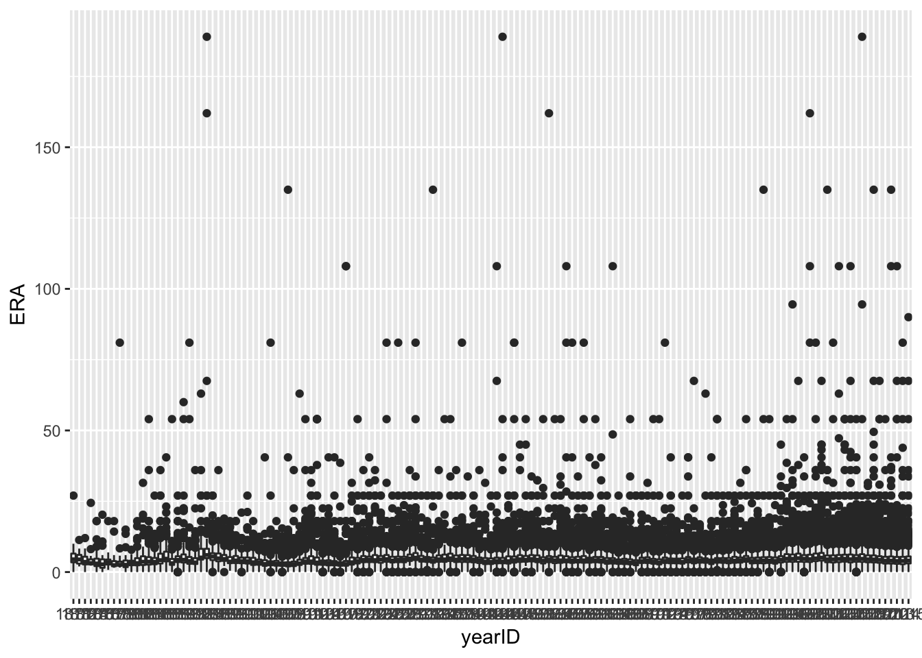
Graph 1: This graph shows the distribution of ERAs for each year. After filtering out ERAs that had null values, I created a simple boxplot with year as the x variable and ERA as the y variable.
pitching_data$yearID <- as.factor(pitching_data$yearID)
summary_ERA <- summarize(group_by(pitching_data, yearID), Q1=quantile(ERA,.25,na.rm=T),median=median(ERA,na.rm=T),
                         Q3=quantile(ERA,.75,na.rm=T),min=min(ERA),max=max(ERA))
summary_ERA
## # A tibble: 145 x 6
## yearID Q1 median Q3 min max
## <fct> <dbl> <dbl> <dbl> <dbl> <dbl>
## 1 1871 3.44 4.5 6.51 0 27
## 2 1872 3.00 4.45 6.07 1.98 11.3
## 3 1873 2.7 3.6 5.43 0 12
## 4 1874 2.7 3.19 4.5 2.25 24.4
## 5 1875 2.12 3.03 4.73 0 18
## 6 1876 1.52 2.73 4.5 0 20.2
## 7 1877 2.67 3.51 4.42 0.75 18
## 8 1878 2.08 2.46 3.87 1.51 18
## 9 1879 2.26 2.57 3.68 1.57 81
## 10 1880 1.75 2.57 4.08 0 15
## # … with 135 more rowssummary_ERA$yearID <- as.numeric(as.character(summary_ERA$yearID))
ggplot(summary_ERA) + geom_line(aes(x=yearID,y=median))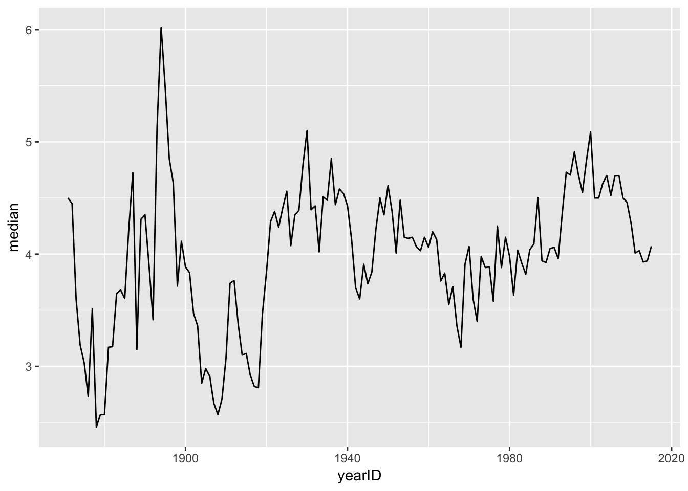
Graph 2: This line graph shows how the median ERA has changed over time. To create this graph, I had to create a summary dataset that had the first quantile, median, third quantile, minimum, and maximum values in it from the ERA variable.
Exercise 2
ggplot(summary_ERA) + geom_ribbon(aes(x=yearID,ymin=Q1,ymax=Q3),fill="lightgreen")+ geom_line(aes(x=yearID,y=median),color="darkblue")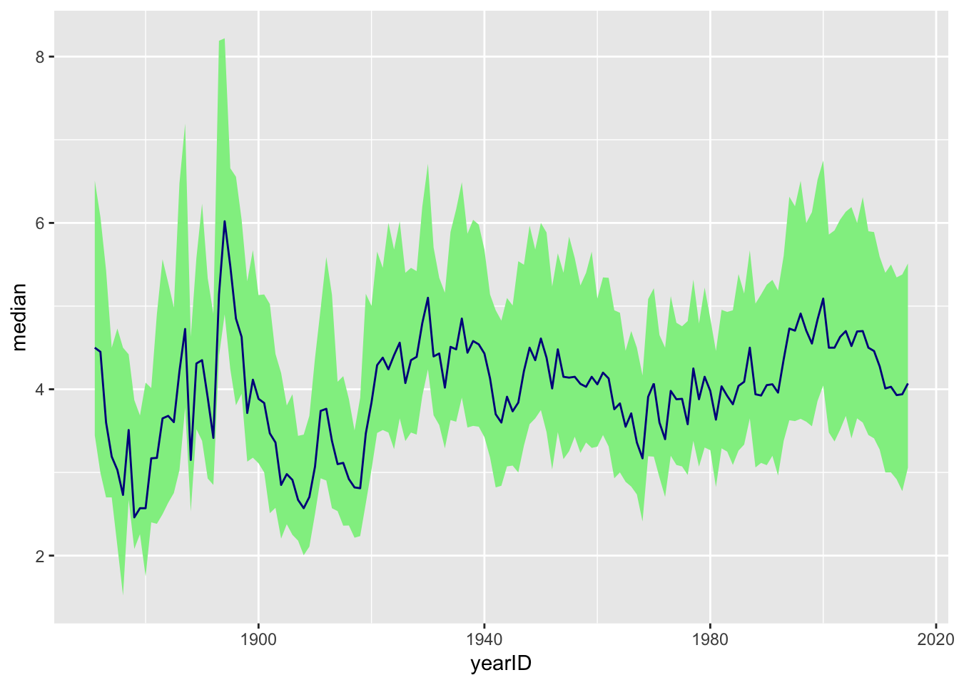
Graph 3: This graph shows the range between the first and third quartiles as depicted by the green ribbon, with the median ERA as the dark blue line.
Exercise 3
# variables
min_games_pitched = 10
low_era = 3
high_era = 6

pitching_data$ERA <- as.numeric(pitching_data$ERA)

# Filtered for 10 games minimum pitched
games_pitched_filtered <- filter(pitching_data, G >= min_games_pitched)
games_pitched_filtered$yearID <- as.numeric(as.character((games_pitched_filtered$yearID)))

summary_ERA_2 <- summarize(group_by(games_pitched_filtered, yearID),era_below_3=sum(ERA <= 3,na.rm=T), era_above_6=sum(ERA >= 6,na.rm=T), below_3_eras_proportion=mean(ERA <= 3,na.rm=T), above_6_eras_proportion=mean(ERA >= 6,na.rm=T), top_era=max(ERA), bottom_era=min(ERA))
tail(summary_ERA_2)
## # A tibble: 6 x 7
## yearID era_below_3 era_above_6 below_3_eras_pr… above_6_eras_pr… top_era
## <dbl> <int> <int> <dbl> <dbl> <dbl>
## 1 2010 110 57 0.211 0.109 11.9
## 2 2011 128 56 0.252 0.110 11.5
## 3 2012 137 54 0.256 0.101 10.1
## 4 2013 136 50 0.260 0.0956 11.0
## 5 2014 163 46 0.313 0.0885 12.8
## 6 2015 134 58 0.236 0.102 13.5
## # … with 1 more variable: bottom_era <dbl>summary_ERA_2$yearID <- as.numeric(as.character(summary_ERA_2$yearID))
ggplot(summary_ERA_2) +
geom_line(aes(x=yearID,y=below_3_eras_proportion,color="3 or under"))+
geom_line(aes(x=yearID,y=above_6_eras_proportion,color="6 or higher"))+
scale_color_manual(values=c("3 or under"="darkblue","6 or higher"="red"),
name="ERA") +
labs(x="Year", y="Proportion", title="Proportion of Pitchers (pitching at least 10 games)\n With Low and High ERAs by Year")+
theme_classic()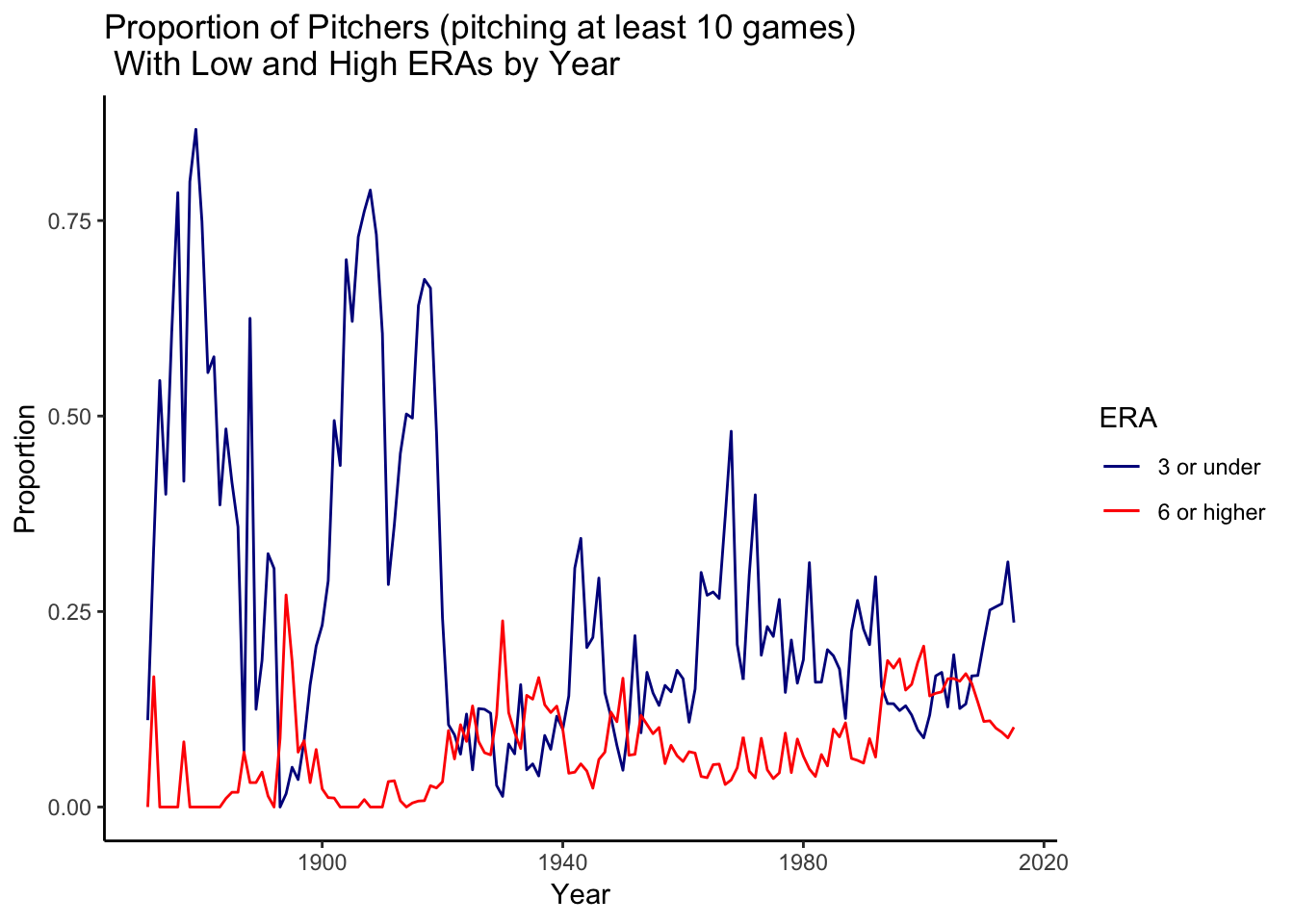
Graph 4: This graph displays the proportion of pitchers who had an ERA less than or equal to 3 and the proportion who had an ERA greater than or equal to 6.
Exercise 4
names(inflation_index)[1] <- "yearID"
head(inflation_index)
## yearID inflation2015
## 1 1980 2.88
## 2 1981 2.61
## 3 1982 2.46
## 4 1983 2.38
## 5 1984 2.28
## 6 1985 2.20salary_data$playerID <- as.character(salary_data$playerID)
player_data$playerID <- as.character(player_data$playerID)
country_data <- inner_join(player_data, salary_data, by="playerID")
country_data <- mutate(country_data,usa_born = ifelse(birthCountry == "USA","Born in USA","Born outside USA"))
salary_sum <- summarize(group_by(country_data, yearID, usa_born),
Q1= quantile(salary,.25, na.rm=T),
median = median(salary, na.rm=T),
Q3 = quantile(salary,.75, na.rm=T),
min=min(salary, na.rm=T),
max=max(salary, na.rm=T))
salary_sum$yearID <- as.numeric(as.character(salary_sum$yearID))
salary_data$salary <- as.numeric(salary_data$salary)
country_summary_left <- left_join(salary_sum, inflation_index, by="yearID")
country_summary_left[country_summary_left$yearID==2015, "inflation2015"]<-1
tail(country_summary_left)## # A tibble: 6 x 8
## # Groups: yearID [3]
## yearID usa_born Q1 median Q3 min max inflation2015
## <dbl> <chr> <dbl> <dbl> <dbl> <int> <int> <dbl>
## 1 2013 Born in USA 501250 1300000 5.00e6 480000 2.90e7 1.02
## 2 2013 Born outside … 502500 1450000 5.20e6 490000 2.10e7 1.02
## 3 2014 Born in USA 511081. 1375000 5.04e6 500000 2.60e7 1
## 4 2014 Born outside … 514750 2000000 6.24e6 500000 2.40e7 1
## 5 2015 Born in USA 520075 1750000 5.50e6 507500 3.26e7 1
## 6 2015 Born outside … 529022 2000000 6.50e6 507000 2.49e7 1country_summary <- mutate(country_summary_left,
median_inflation_adjusted = median*inflation2015,
Q1_inflation_adjusted = Q1*inflation2015,
Q3_inflation_adjusted = Q3*inflation2015,
min_inflation_adjusted = min*inflation2015,
max_inflation_adjusted = max*inflation2015)
ggplot(country_summary)+
geom_ribbon(aes(x=yearID,
ymin=Q1_inflation_adjusted,
ymax=Q3_inflation_adjusted,
fill=usa_born), alpha=.4)+
geom_line(aes(x=yearID,
y=median_inflation_adjusted,
color=usa_born),size=1)+
scale_y_continuous(labels=scales::dollar)+
labs(y="Annual Salary \n (Adjusted for Inflation)", x="Year", title="Salaries of Middle 50% of Earners in Major League Baseball") +
scale_color_discrete(name="Median") +
scale_fill_discrete(name="Middle 50% Earners") +
theme_minimal()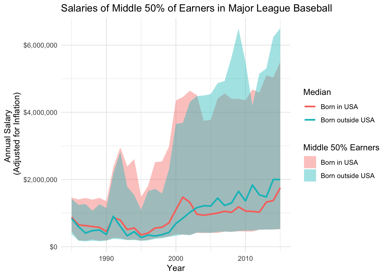
Graph 5: This graph displays the salaries for the central 50% of earners divided between players who were born in the United States and who were born outside the United States.
Conclusions
The line graphs show that ERA has fluctuated over the years, but the range at which it fluctuates has decreased over time. ERAs of 3 or under have decreased by a lot over time, leading me to believe that batters have gotten better over the years. Another conclusion that can be made from the fifth graph. It seems as if the median salary for players born outside the US is higher than those born on the US.