Guided Exercise 4
Goal
The goal of this analysis was to determine how temperature anamolies have changed since 1880. I plan to use line graphs to illustrate the change over time. # Data This dataset gives historical temperature anomalies in degrees Celsius. According to NOAA, “the term temperature anomaly means a departure from a reference value or long-term average. A positive anomaly indicates that the observed temperature was warmer than the reference value, while a negative anomaly indicates that the observed temperature was cooler than the reference value.” You can read more about this type of data at NOAA’s website. The dataset contains the global average temperature anomaly for every month from January 1880 to the present. This data is contained in monthly_global_land_and_ocean_temperature_anomalies.csv; you can download this data yourself and read more about it here - https://www.ncdc.noaa.gov/cag/global/data-info.
library(tidyverse)
library(lubridate)
##
## Attaching package: 'lubridate'## The following object is masked from 'package:base':
##
## date# load the temperature anomalies data from the csv
monthly_temps <- read.csv("monthly_global_land_and_ocean_temperature_anomalies.csv")
# add column called month_number to monthly_temps making the values equal to their row number
monthly_temps <- mutate(monthly_temps, month_number = row_number())
# makes the existing column YearMonth and turns it into a date value
# if day value doesn't exist, fill in with 1
monthly_temps <- mutate(monthly_temps, date = ymd(YearMonth, truncated=1))
# converts date column into year and month column, where month is equal to its abbrevation
monthly_temps <- mutate(monthly_temps,
year=year(date),
month=month(date,label=TRUE))
# changes name of column from Value to temperature_anomaly
monthly_temps <- rename(monthly_temps, temperature_anomaly = Value)
# delete the column YearMonth as it is not necessary any longer
monthly_temps <- select(monthly_temps, -YearMonth)# generate line graph
ggplot(monthly_temps,
aes(x=month,
y=temperature_anomaly,
group=year,
color=temperature_anomaly))+
geom_line()+
labs(title="Historical Temperature Anomalies\n Since 1880 by Month",
y="Temperature Anomaly in Degrees Celsius",x=element_blank())+
scale_color_gradientn(colors=rev(rainbow(2)), guide=FALSE)+
scale_x_discrete(breaks=c("Feb","Apr","Jun","Aug","Oct","Dec"))+
theme_minimal()
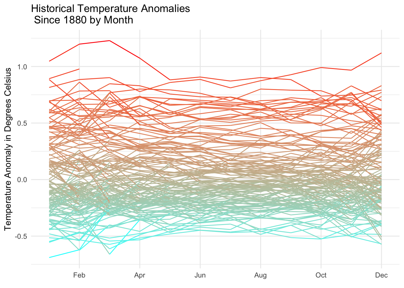
Graph 1: This graph shows the Historical Temperature anamolies in degrees Celsius by Month since 1880. The dataset took a lot of manipulating to produce this graph. The process of convert the data to year and month took some mutation with the help of the package lubridate.
# generate polar coordinate graph
ggplot(monthly_temps,
       aes(x=month,
           y=temperature_anomaly,
           group=year,
           color=temperature_anomaly))+
  geom_line()+
  labs(title="Historical Temperature Anomalies\n Since 1880 by Month",
       y="Temperature Anomaly in Degrees Celsius",x=element_blank())+
  scale_color_gradientn(colors=rev(rainbow(2)), guide=FALSE)+
  scale_x_discrete(breaks=c("Feb","Apr","Jun","Aug","Oct","Dec"),expand=c(0,0))+
  scale_y_continuous(breaks=NULL)+
  coord_polar(theta="x",start=0)+
  theme_minimal()
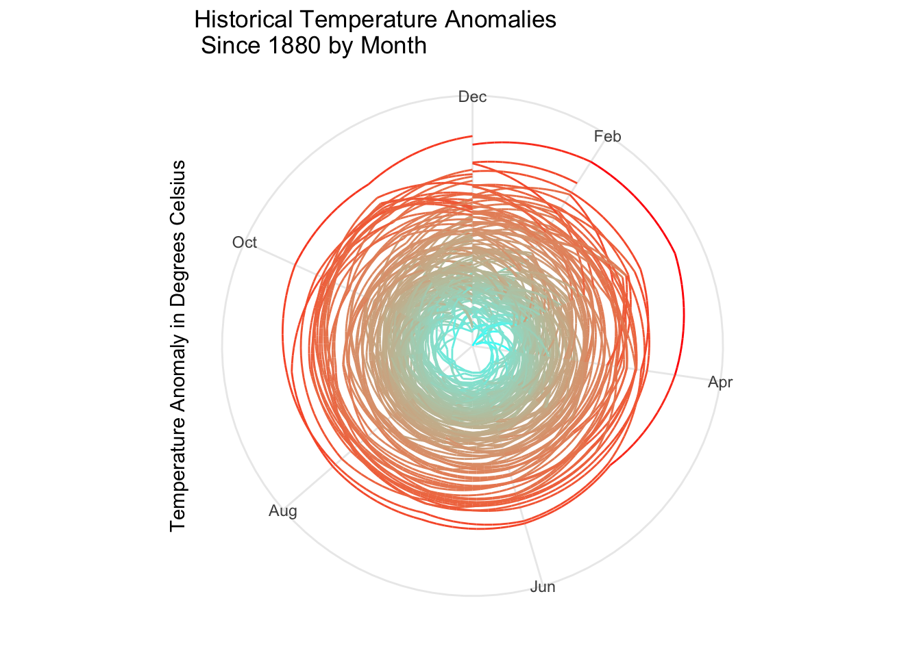
Graph 2: This polar coordinate graph is a similar graph to the line graph above, but uses x as theta to invert the graph.
Conclusions
Historical temperature anamolies have clearly risen since 1880. There are big spikes in Janurary or February in many years. This makes sense because those are temperatures that were higher than usual winter temperatures.